
 Shiina Labs
In the first article, I wrote about why I pulled the chart layer out of WiFi Lens. This article looks at the next question: how ChartLens works inside a real app, and what engineering decisions shaped its features.
The examples come from the ChartLens DemoApp, a standalone macOS app that exercises the chart features without WiFi Lens business code. The DemoApp keeps the examples small enough to explain the design.
Building the first chart
Start with a line chart.
The code below uses pseudocode. It shows the structure, not production code.
This small example draws a complete line chart. It gives the reader the main shape of ChartLens: data, style, and rendering stay separate, so the app layer can focus on the data it owns.
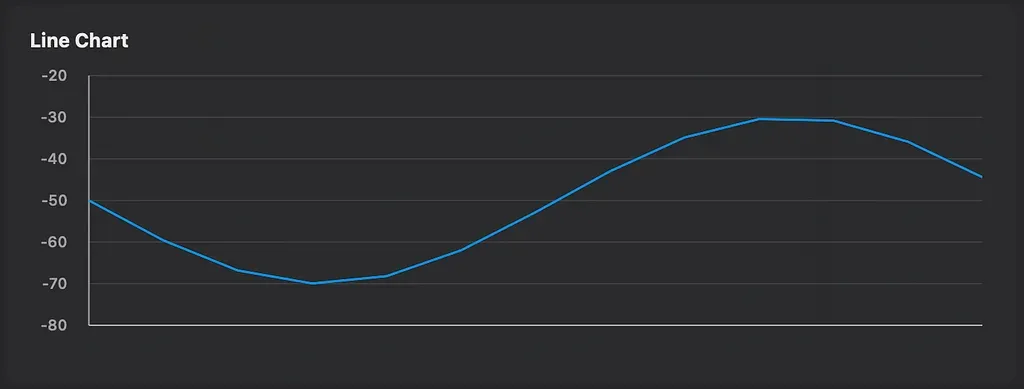
DemoApp screenshot, BasicChartsDemo Line Chart
let points = ...

let series = ChartSeries(
    points: points,
    style: .line(color: .blue)
)

Chart(
    series: [series],
    axis: ...
)
Three concepts carry the chart. ChartPoint represents data. ChartSeries groups points that share one rendering style. ChartSeriesStyle controls visual choices such as color, line width, and interpolation mode.
The parameter list does not matter here. The split matters: data, style, and rendering entry point each take one job.
Data flows from ChartPoint into ChartSeries, then into Chart. Chart handles coordinate mapping, axis labels, grid lines, and curve rendering. The app prepares the data and leaves chart work to the chart layer.
This simple example already shows the core design. The chart renders. The app owns the data. The two sides stay apart as much as possible. Interactions, overlays, and specialized chart types build on that split.
Adding interaction
Static charts show data. Users still need answers from the chart: what is the exact value here, what nearby points look like, and whether they can zoom into a smaller range.
ChartLens centers interaction around three callbacks:
ChartInteraction(
    onHover: { point, screenPt, location in
        // Mouse movement returns the nearest data point.
    },
    onTap: { point in
        // Tap returns the nearest data point.
    },
    onZoom: { xMin, xMax in
        // Drag-to-zoom returns the new X range.
    },
    zoomGestureEnabled: true
)
All callbacks run on @MainActor. The app owns the business state. ChartLens does not store hover state or selection state inside the chart. It detects input and reports the result.
Hit testing uses a simple rule: scan all points in all series, then choose the point with the smallest X-axis distance from the cursor. It uses no Y-axis threshold and no radius check. This works well for time-series data. As the cursor moves left and right, the crosshair locks onto the nearest time point without jitter.
The crosshair itself is an overlay:
Chart(series: series, axis: axis, interaction: interaction) { geo, _ in
    CrosshairOverlay(
        geometry: geo,
        hoverPoint: hoverPoint,
        config: CrosshairConfig(valueLabelFormatter: { String(format: "%.1f dBm", $0) })
    )
}
CrosshairOverlay receives ChartGeometry and the current hover point. It draws the vertical line, the point marker, and the value label with a gradient background on Canvas. The app passes the point from onHover; the overlay handles the drawing.
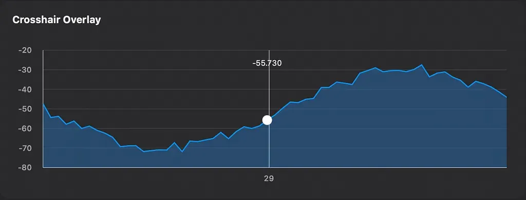
Showing cursor tracking
Synchronizing multiple charts: Detail + Overview
Some screens need both the full range and a close-up view. A roaming test may run for several minutes, while the user only wants to inspect a few seconds of AP handoff events.
DetailOverviewChart packages that pattern into one component. The top chart shows the current detail window. The bottom overview strip shows the full data range and a draggable range selector.
DetailOverviewChart(
    series: series,
    domain: 0...200,
    defaultWindowSpan: 40,
    domainLabel: { String(format: "%.0fs", $0) }
)
domain defines the full data range. defaultWindowSpan defines the initial visible window. The user can drag either handle to resize the window or drag the body to pan.
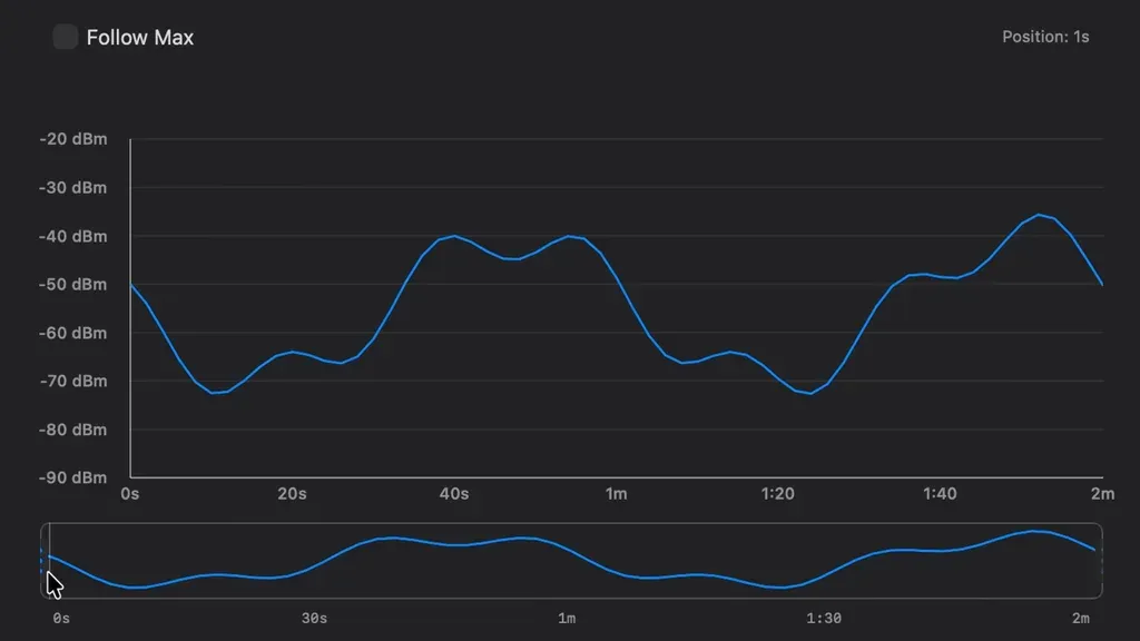
DetailOverviewDemo GIF showing drag and zoom
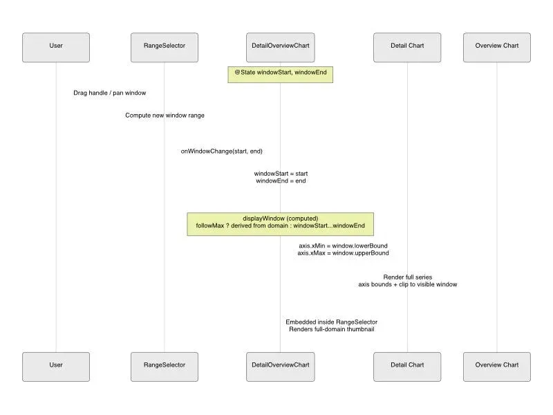
Architecture diagram showing detail chart, RangeSelector, and overview chart data flow
RangeSelector owns the drag behavior. The left handle changes the start. The right handle changes the end. The window body pans the range. It also supports followMax, which keeps the visible window pinned to the newest data when the domain grows, like tail -f for charts.
A detail from WiFi Lens changed the implementation. followMax needs to derive the window from domain through a computed property. A @State value plus an onChange chain creates a one-frame delay because SwiftUI runs onChange(of:) after body calculation. In a real-time chart, that one frame shows up.
Extending charts with overlays
ChartLens follows one rule: the chart calculates geometry and draws the base visual; the app injects product UI through overlays.
The overlay builder has this shape:
@ViewBuilder overlay: (ChartGeometry, [any ChartSeriesProtocol]) -> OverlayThe chart passes ChartGeometry into the overlay. That structure bridges data space and screen space:
let screenPoint = geo.dataToPoint(x: 42.0, y: -55.0)
let dataPoint = geo.pointToData(screenPoint: someCGPoint)
Once the app has coordinate mapping, it can draw product-specific UI on top of the chart.
Threshold line: draw a dashed line at a specific Y value on Canvas without changing the chart renderer.
Canvas { context, _ in
    let y = geo.chartRect.maxY - (threshold - geo.yMin) * geo.scaleY
    var line = Path()
    line.move(to: CGPoint(x: geo.chartRect.minX, y: y))
    line.addLine(to: CGPoint(x: geo.chartRect.maxX, y: y))
    context.stroke(line, with: .color(.red.opacity(0.6)),
                   style: StrokeStyle(lineWidth: 1, dash: [5, 3]))
}Tooltip: use the hover point and dataToPoint to place an information card near the data point.
Data labels: place persistent labels above points and use annotationRect to keep them away from axis labels.
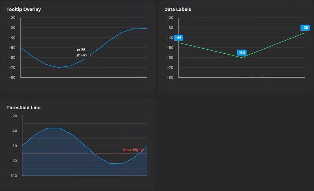
OverlayDemo screenshot showing Tooltip Overlay, Data Labels, and Threshold Line
annotationRect deserves its own mention. ChartLens splits the chart area into frameRect, plotRect, annotationRect, and axisLabelRects. If every UI element uses plotRect, labels cover curves and tooltips get clipped. annotationRect gives persistent labels and callouts a legal region of their own.
The engineering behind these features
The earlier sections show how to use ChartLens.
The work that took the most time sits behind those APIs. Many features came from WiFi Lens needs. When existing approaches failed inside the product, I moved the solution into ChartLens instead of adding more code to each screen.
Choosing interpolation modes
ChartLens currently provides five curve modes: linear, Catmull-Rom, clamped cubic, step, and Gaussian.
These modes exist because different data behaves differently. I added clamped cubic because a real data problem showed up, not because I wanted one more visual option.
Clamped cubic is the case worth explaining.
Catmull-Rom gives smooth curves by using neighboring points to estimate tangent direction. When data jumps, the tangent can push the curve outside the Y range of the points. For RSSI, that means the chart displays a signal strength that never happened.
Clamped cubic uses Fritsch-Carlson monotone cubic Hermite interpolation to avoid that. It does not clamp control points in screen space, which would create corners. It adjusts tangent magnitude. When adjacent slopes point in different directions, the algorithm scales the tangent so the curve stays inside the data range. The curve avoids overshoot while keeping C1 continuity, so each data point still has a smooth tangent.
The DemoApp includes SplineOvershootDemo with two datasets: one drop case, 100 → 10 → 10 → 10 → 50, and one rise case, 10 → 10 → 10 → 100 → 10. Catmull-Rom overshoots in both. Clamped cubic stays inside the data range.
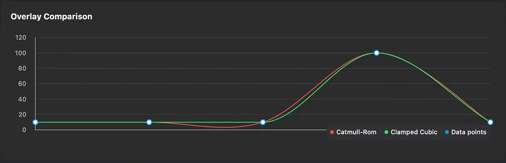
SplineOvershootDemo screenshot showing Drop and Rise comparisons
Gaussian curves
A Wi-Fi spectrum chart is not a normal line chart.
Each AP represents a coverage range, not one sampled point. A plain line connection looks wrong and fails to show how nearby channels overlap. ChartLens treats Gaussian as a special curve generation strategy instead of a normal interpolation mode.
Each AP only needs two data points, the left and right channel boundaries, plus one RSSI value as amplitude. ChartLens turns that into an 80-step smooth bell curve.
sigma controls the curve width and comes from the channel bandwidth, using halfWidth / 4. The curve tail fades toward the noise floor. Multiple APs can stack independently with their own colors and opacity.
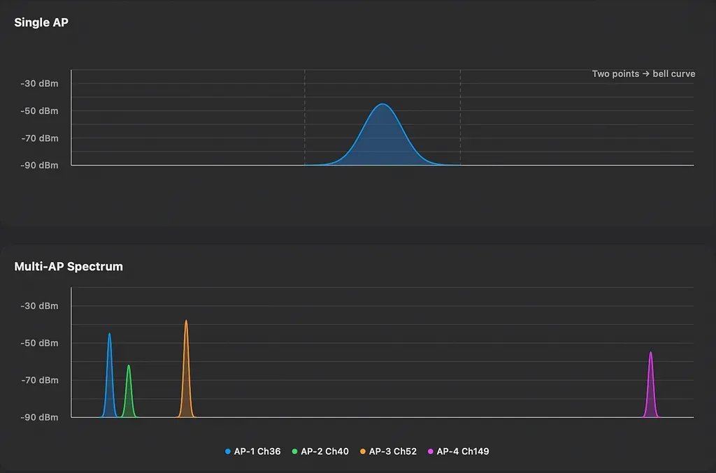
GaussianDemo screenshot showing Single AP bell curve and Multi-AP spectrum overlay
Coordinate mapping and region separation
ChartGeometry sits at the center of coordinate calculation. It stores plotRect, the actual drawing area, and the data range: xMin, xMax, yMin, and yMax. It provides two conversions: dataToPoint and pointToData.
This design looks ordinary, but it shapes the whole chart system. Overlay, Tooltip, Crosshair, and Annotation all use the same mapping instead of keeping their own coordinate math.
ChartLens splits chart regions into four parts. frameRect is the full component. plotRect holds the curves. axisLabelRects holds axis labels. annotationRect gives product annotations a valid area.
That split fixes common product bugs: tooltips running into axis labels, labels covering curves, and annotations having no safe place to live. Each UI element knows where it belongs.
Protocol-driven extensibility
One more design matters: how ChartLens grows.
ChartLens does not build every chart type into the core. It separates data, renderer, and series through protocols. A new chart type does not require changes to Chart.
ChartPointProtocol          → data point interface
ChartSeriesRenderer<Point>  → renderer interface
ChartSeriesProtocol<Point>  → series interface, combining data and renderer
Chart
Adding a new chart type takes three steps:
// 1. Define a new data point type.
struct CustomPoint: ChartPointProtocol { ... }

// 2. Implement the matching renderer.
struct CustomRenderer: ChartSeriesRenderer { ... }

// 3. Combine them into a new ChartSeries.
ChartSeries(...)
The steps are simple. The important part is that Chart stays unchanged. Protocol-driven design lets the library add chart types through extension instead of core edits.
ChartLens does not need to know every chart type. Line charts, area charts, Gaussian curves, and candlestick charts all implement the same set of ideas. The app decides what to draw. ChartLens handles coordinate mapping and layout.
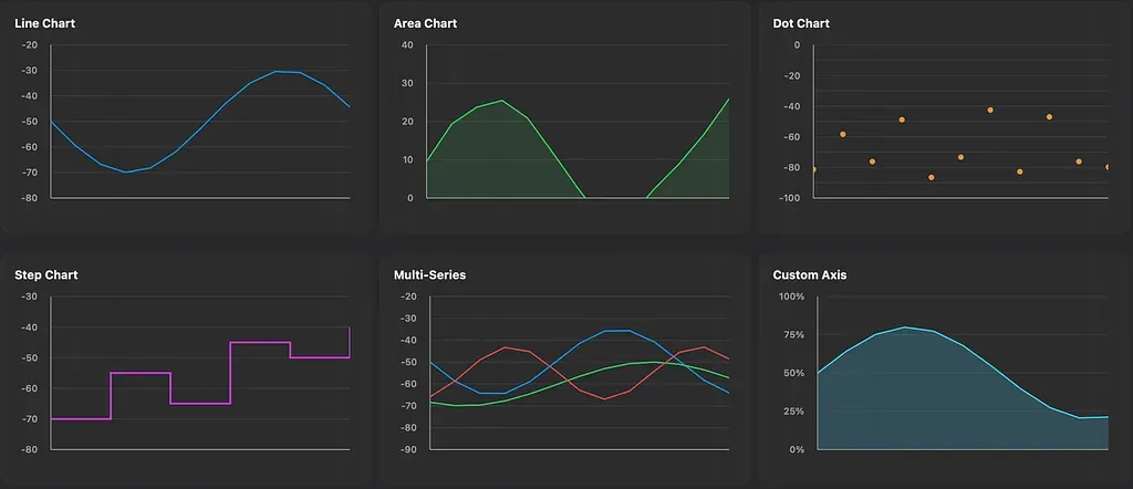
Comparison screenshots from BasicChartsDemo, GaussianDemo, and CandlestickDemo
Back to WiFi Lens
How do these pieces show up in WiFi Lens?
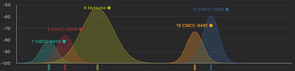
WiFi Lens screenshot, spectrum chart BandChartView
Spectrum chart (BandChartView) uses Gaussian curves to render AP channel occupancy. Each AP only needs two data points, the left and right channel boundaries, plus one RSSI value. ChartLens generates the smooth bell curve. Multiple APs stack with separate colors and opacity. The app layer adds SSID labels, tooltips, and channel occupancy heatmaps through overlays without changing the ChartLens renderer.
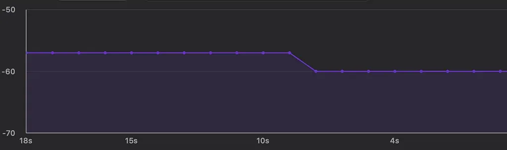
WiFi Lens screenshot, trend chart TrendChartView
Trend chart (TrendChartView) uses linear interpolation and area fill to show RSSI changes over time. The filled area makes signal changes easier to read.
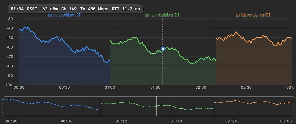
WiFi Lens screenshot, roaming timeline RoamingTestView
Roaming timeline (RoamingTestView) uses DetailOverviewChart for long-running roaming events. The overview strip shows the full test. The detail chart zooms into AP handoff moments. The user drags the window to inspect different time ranges.
These screens look different, but they share coordinate mapping, hit testing, overlay injection, and region management. ChartLens handles chart infrastructure. WiFi Lens focuses on Wi-Fi behavior.
Closing thoughts
ChartLens did not start as an abstraction exercise.
Almost every feature came from a problem I hit while building WiFi Lens: coordinate mapping, overlays, real-time zooming, Gaussian curves, and boundary overflow. When the same problem appeared again, I moved the solution into reusable chart infrastructure instead of adding one more local fix.
I did not design ChartLens first and search for use cases later. It grew through product work.
If you build complex charts in SwiftUI, I hope these examples help you decide where chart code should end and product code should begin.
Project links
- ChartLens GitHub repository, including DemoApp: https://github.com/ShiinaLabs/chart-lens
- WiFi Lens GitHub repository: https://github.com/ShiinaLabs/wifi-lens